Pro Print
Creative direction for a modern commercial printing brand built to showcase capability, originality, and scale from day one.
Industry: Commercial Printing
Timeline: ~3 months
Role: Creative Director / Producer
Tools: Adobe Suite, Figma, Shapr3D
Pro Print was founded by a former commercial printing executive returning to the market after the conclusion of a non-compete. The project involved creative directing an agency team to establish a new brand and visual system designed to compete immediately within a highly saturated print landscape.

Pro Print was a new company with no legacy constraints, but significant expectations. The goal was to create a brand that felt established, capable, and credible from launch—while clearly differentiating itself from the formulaic look common in commercial printing.
The challenge was twofold: design a system strong enough to stand on its own, and flexible enough for the client’s internal team to extend and evolve after handoff across a wide range of services and applications.

The strategy focused on balancing clarity with originality. Rather than defaulting to familiar print-industry aesthetics, the brand was positioned to demonstrate confidence through restraint, while allowing moments of visual surprise to showcase technical capability.
Key decisions included:
Anchoring the brand in a minimal core palette
Using full-spectrum color as a supporting element rather than the foundation
Designing print concepts that demonstrated capability through interaction, not explanation
The guiding principle throughout was simple: be clever, but don’t break the brand.

Execution centered on color and print experimentation. A controlled base palette of teal, white, and black established consistency, while expansive pigment ranges were introduced selectively to highlight Pro Print’s technical range.
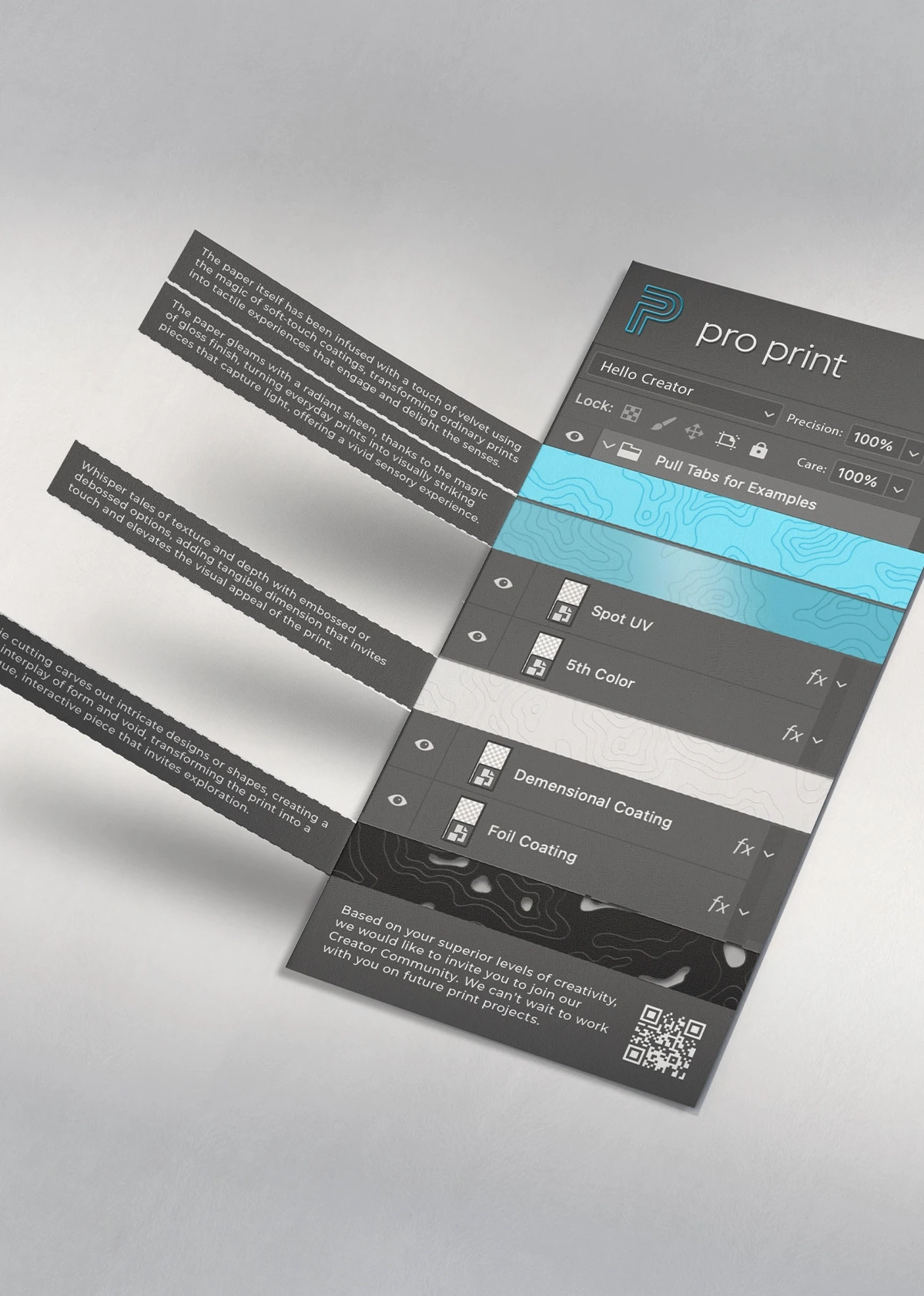
Print became the primary storytelling medium. Custom samples, promotional materials, and experimental pieces explored perforation, folding, layering, and interaction—designed not just to look good, but to demonstrate what the business could do better than its competitors.
Once the core system and print concepts were established, deliverables were handed off to the client’s internal team to implement and expand across web and marketing channels. While execution evolved beyond the original vision, the system provided a clear foundation and creative direction for continued growth.

This project reinforced the importance of respecting context over rules. When a client’s capabilities remove traditional limitations, the role of creative direction becomes one of discernment rather than restriction.
It also highlighted the value of hierarchy within bold systems—allowing experimentation to exist without undermining coherence. The work remains a clear example of how originality, when properly structured, can elevate even the most utilitarian categories.


More Work


[ LET'S TALK ]
If you’re building something that matters, I’d love to hear about it.
[ LET'S TALK ]
If you’re building something that matters, I’d love to hear about it.
Pro Print
Creative direction for a modern commercial printing brand built to showcase capability, originality, and scale from day one.
Industry: Commercial Printing
Timeline: ~3 months
Role: Creative Director / Producer
Tools: Adobe Suite, Figma, Shapr3D
Pro Print was founded by a former commercial printing executive returning to the market after the conclusion of a non-compete. The project involved creative directing an agency team to establish a new brand and visual system designed to compete immediately within a highly saturated print landscape.
Pro Print was a new company with no legacy constraints, but significant expectations. The goal was to create a brand that felt established, capable, and credible from launch—while clearly differentiating itself from the formulaic look common in commercial printing.
The challenge was twofold: design a system strong enough to stand on its own, and flexible enough for the client’s internal team to extend and evolve after handoff across a wide range of services and applications.
The strategy focused on balancing clarity with originality. Rather than defaulting to familiar print-industry aesthetics, the brand was positioned to demonstrate confidence through restraint, while allowing moments of visual surprise to showcase technical capability.
Key decisions included:
Anchoring the brand in a minimal core palette
Using full-spectrum color as a supporting element rather than the foundation
Designing print concepts that demonstrated capability through interaction, not explanation
The guiding principle throughout was simple: be clever, but don’t break the brand.
Execution centered on color and print experimentation. A controlled base palette of teal, white, and black established consistency, while expansive pigment ranges were introduced selectively to highlight Pro Print’s technical range.
Print became the primary storytelling medium. Custom samples, promotional materials, and experimental pieces explored perforation, folding, layering, and interaction—designed not just to look good, but to demonstrate what the business could do better than its competitors.
Once the core system and print concepts were established, deliverables were handed off to the client’s internal team to implement and expand across web and marketing channels. While execution evolved beyond the original vision, the system provided a clear foundation and creative direction for continued growth.
This project reinforced the importance of respecting context over rules. When a client’s capabilities remove traditional limitations, the role of creative direction becomes one of discernment rather than restriction.
It also highlighted the value of hierarchy within bold systems—allowing experimentation to exist without undermining coherence. The work remains a clear example of how originality, when properly structured, can elevate even the most utilitarian categories.
More Work
[ LET'S TALK ]
If you’re building something that matters, I’d love to hear about it.